The details that make a collection feel connected.
Shape sets the tone
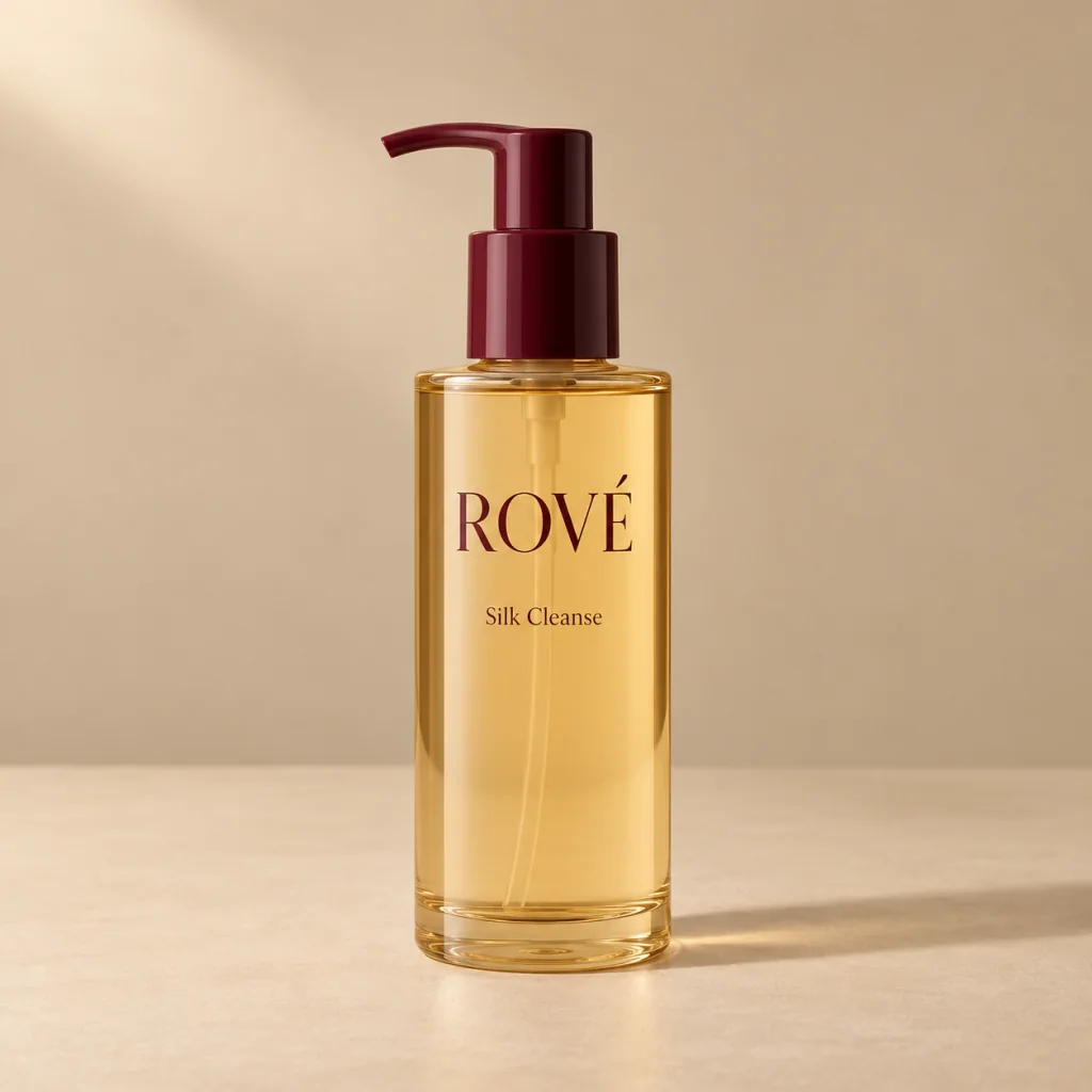
A tall pump bottle feels different from a low, rounded jar. In this fictional collection, each shape gives the product its own silhouette on the shelf.
Material catches the light
Frosted surfaces soften reflections, while clear bottles reveal depth and color. These contrasts make a product photograph interesting without adding decorative props.
Less lettering, more space
A simple brand mark and a clear product name keep the packaging easy to read. Space around the lettering is part of the design, too.
Leave a Reply